We have a classic suburban dining problem. The room is attached to our open living area – about 12×10 feet, one window, a plain builder chandelier, and beige walls that match the rest of the house. Our furniture is fine but nothing special: a medium‑brown oak table (hand‑me‑down), four simple chairs, and a small buffet that's seen better days.
We don't have $2,000 for a new table, chairs, or lighting. But I can swing $80 for a gallon of good paint and a weekend of work.
So I'm asking: can the right warm paint color make this room feel intentional, cozy, and maybe even a little custom – without changing a single piece of furniture?
I've done some research and played with online visualizers. But I need real talk from people who've actually painted a boring dining area and seen it come to life.
What I'm hoping paint alone can do
Problem | Can paint fix it? |
|---|---|
Room feels like a hallway with a table | ✅ Yes – a distinct color can define the space |
Furniture looks dated (oak table, basic chairs) | ✅ Maybe – warm walls can make wood tones feel richer |
No architectural details (plain drywall, standard trim) | ✅ Yes – color creates its own depth |
Room feels cold and uninviting | ✅ Yes – warm tones add psychological coziness |
Poor lighting (single overhead fixture) | ⚠️ Partially – paint won't fix bad light, but can soften it |
Furniture is mismatched or worn | ❌ No – paint won't hide major damage, but can distract |
So paint isn't magic. But for $80, it might be the best bang‑for‑buck we can get.
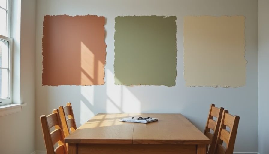
The paint colors I'm considering (all warm, no gray)
I've narrowed it down to three directions. Would love feedback on which might work best with medium oak furniture and north‑facing light.

1. Soft terracotta / clay (e.g., Farrow & Ball "Red Earth" or similar, but cheaper)
Why: Adds instant warmth and depth. Plays nicely with wood tones.
Risk: Could feel too bold or dark in a small room. Might clash with beige adjacent walls (open floor plan – the dining area flows into a beige living room).
2. Warm olive / sage green (e.g., Sherwin‑Williams "Dried Thyme" or "Clary Sage")
Why: Green is having a moment, but this is a muted, earthy version. Complements oak nicely. Feels both classic and fresh.
Risk: Could read as dull or muddy in low light. Needs enough contrast with white trim.
3. Deep buttery cream / warm off‑white (e.g., Benjamin Moore "Navajo White" or "Pale Oak")
Why: Safest choice. Warmer than builder beige, but still neutral. Makes the room feel brighter and larger.
Risk: Might not change the room enough – could still feel like "almost beige." Might not distract from dated furniture.
4. Warm dusty blue (e.g., Farrow & Ball "Borrowed Light" or SW "Misty")
Why: Blue is technically cool, but dusty blues with green undertones feel warm. Plays well with oak and white trim.
Risk: Could fight with warm oak and make the room feel disjointed. I'd need to see a sample first.
What I'm not changing (for now)
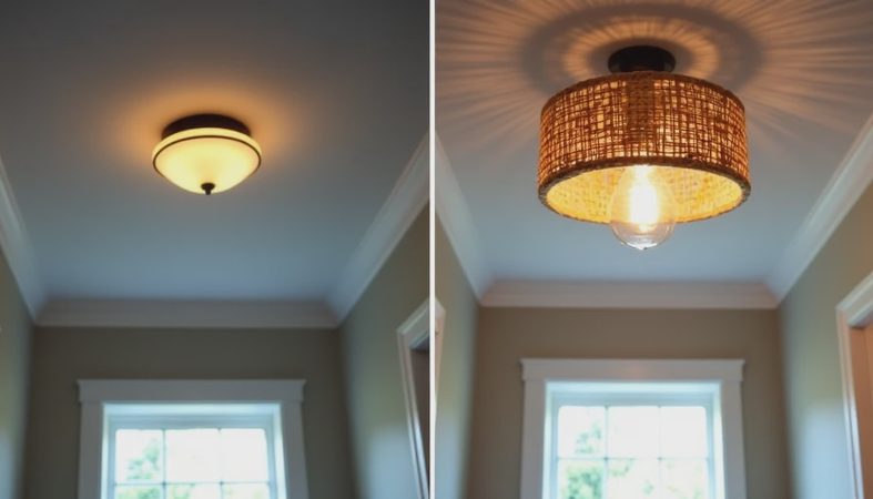
The chandelier: Builder grade, but not hideous. Maybe I'll swap it next year.
The chairs: Four simple wood chairs. Could I paint them? Maybe. But that's a separate project.
The buffet: Scratched top, but functional. A runner or a plant could hide the worst of it.
The rug: We have a neutral jute rug that's fine. Might upgrade later.
So the furniture stays exactly as‑is. The only variable is the wall color.
Where I need the community's advice
1. Has anyone done this – painted a dining room a warm, distinct color and kept builder‑grade or hand‑me‑down furniture?
Did it work? Or did the nice walls just make the furniture look shabbier by contrast?
2. What specific paint colors have you used that made oak furniture look intentional rather than dated?
I've heard that green and terracotta are good. I've also heard that too‑warm yellow can make oak look orange. What's your experience?
3. How do you handle the "open floor plan" problem?
Our dining area flows directly into a living room that's staying builder beige (for now). If I paint the dining area a bold warm color, will the transition be jarring? Should I paint the living room too (not in the budget yet)?
4. Any tricks to make a small dining area feel bigger with warm colors?
I've heard: paint the ceiling a lighter version, or paint the trim a contrasting white, or add a mirror. What actually works?
5. Show me your before/afters!
If you've done a low‑budget dining room makeover with just paint (and maybe small styling changes), please share photos or describe the transformation. I need inspiration – and courage.

The plan if I go for it
Buy sample pots of 3 colors (maybe a terracotta, a sage, and a creamy white). Paint large swatches on each wall, live with them for a week.
Choose the winner. Buy a gallon of eggshell or matte (low‑VOC – toddler in the house).
Prep (tape, drop cloths, fill holes). Paint one weekend while my partner takes the toddler to the park.
Live with it for a month. Then reassess – does the furniture need help? Maybe a $50 table runner, a thrifted mirror, or painting the chairs a contrasting color?
Total budget: under $150 with samples and supplies.

No comments yet — be the first to share a thought.